- This is a html/css/js draft for a redesign of the board.php output.
- it is interactive to some extent, but has no real functionality implemented! As said, it's a layout/UI proposal. if it is accepted, we can see further to implement functionality.
- File sizes and therefore loading speed for should could be improved yet
- currently it is tested on firefox 26 and latest chrome – as a draft, i have tried to make it easy to adapt to other and older browsers, but did not test yet!
- i quick-checked on an ipad 2, where alternate layout kicks in. i have not tested on smaller devices than ipad2 in portrait mode yet.
- Layout is made for desktop/laptop 1280px+ widescreens – done for as little vertical scrolling as possible. width on this devices is plently, height is rare.
- Layout changes on smaller screens (view on tablet or phone, resize your browser window to see). The little horizontal space on these devices is used better, but we need to have a little more vertical scrolling to compensate. Currently the width limit is the small maps width ... can't do much about that.
- to test smaller width on desktop view, just resize your browser window to below 1200px width or smaller
- The section separators in the left column (see dropdown arrows) can be clicked – then this section is hidden. This could be used as personal setting too to default close unwanted sections and optimize loading speeds for mobile users (load section via ajax only when it is opened by user?)
- Ajax functionality could be done especially in chat and orders section too. This is a feature add on, not part of this draft.
- Existing information and interaction elements are re-grouped in logical groups instead of rather random
- Interaction directions are based on western reading direction (top>bottom, left>right)
- Interface elements are unificated: all interactive elements look like buttons or form elements (except main site menus to keep them slim), all information elements look like text
- Visual Design is not much altered. color palette is the same as before, background changed for mobile flexible layout only
- I have not added new icons or altered existing ones. Some things there could be improved, some text could be exchanged for shorter icons (like votes?)

Header contains the current main menu items, plus some additions (like direct links to your own games).
The items are placed in subgroups belonging together (Logon/off, personal settings, platform games overview, help&communication)
this currently looks best on firefox (distributed to full width), second best in chrome (no distribution yet, as css feature is not supported yet)
The items are placed in subgroups belonging together (Logon/off, personal settings, platform games overview, help&communication)
this currently looks best on firefox (distributed to full width), second best in chrome (no distribution yet, as css feature is not supported yet)
Games needing attention
The list of games that need your attention right now.
This could be extended to all games in a different "passive" color, but might be too much?
This could be extended to all games in a different "passive" color, but might be too much?
- WWIV Let's Do This!


- Shadow of a doubt

- City States-3
- ... and I will stand by you
- European
Holy Wars! or a longer game title
Information is re-grouped into general game settings (start parameters), current game status (Turn, next phase, current votes), current personal status in this game, and personal votes
Settings
- First crusade
- 1 days/phase
- Fullnames
- 120
 | PPSC
Status
- Autumn 1099 | Builds
- Next: 2114 (02:00 PM)
 paused
- draw request pending
Your Status
- Russia
- Bet 10 | Worth 14
- 9 centers | 9 units
- Russia
Votes
- draw
Diplomacy
- Nation tabs are identifyable as such, current open chat partner is highlighted
- info about the chat partner is limited to what i need to know when chatting. more details are available in the players list further below anyway
- the chat box has a new feature proposal of turn separators to see when turns ended within chats.
- Text box is aligned left same width as the chat log (establishing a direct visual connectiona nd flow upwards when writing).
- the chat relevant functions of mark as unread, mute player and send message are on the right now (left to right action order).
- The chat could be done per ajax for faster loads, reduced data transfer and not disturbing rest of page when sending a message (like deleting unsaved orders when a message is sent).
- Global
- Holy Roman Empire
- England
- France
- Seljuk Turks
- Byzantine Empire
- Almoravids
- Notes
| Holy Roman Empire | 12 centers | 12 units | PlanetXXX13 | 108 | 98+ reliability | seen 247 | Pause, Draw |
| Spring 1098 | Retreats Phase | |
| Russia Turks asked me if they can have Con and Ath ... i semi-agreed to the to make him easy and move west, while i'm preparing moving south now.about Ath: is moving Servia to Dyr an option for you at the moment? Nissa goes to Mac, and we would have access to Ath in autumn to either take it ourselves, or prevent Turks to take it. | Mon 09 PM |
| Holy Roman Empire I'll reply when I can get to a computer. Bit tricky on a phone! | Mon 09 PM |
| Holy Roman Empire Turks: Yes, I believe I should move further south. If Lom disbands I'll move Ven down too. | Mon 09 PM |
| Autumn 1099 | Diplomacy Phase | |
| Russia Turks asked me if they can have Con and Ath ... i semi-agreed to the to make him easy and move west, while i'm preparing moving south now. about Ath: is moving Servia to Dyr an option for you at the moment? Nissa goes to Mac, and we would have access to Ath in autumn to either take it ourselves, or prevent Turks to take it. | Mon 09 PM |
| Holy Roman Empire I'll reply when I can get to a computer. Bit tricky on a phone! | Mon 09 PM |
| Holy Roman Empire Turks: Yes, I believe I should move further south. If Lom disbands I'll move Ven down too. | Mon 09 PM |
| Russia Turks asked me if they can have Con and Ath ... i semi-agreed to the to make him easy and move west, while i'm preparing moving south now. about Ath: is moving Servia to Dyr an option for you at the moment? Nissa goes to Mac, and we would have access to Ath in autumn to either take it ourselves, or prevent Turks to take it. | Mon 09 PM |
| Autumn 1099 | Builds phase | |
| Holy Roman Empire I'll reply when I can get to a computer. Bit tricky on a phone! | Mon 09 PM |
| Holy Roman Empire Turks: Yes, I believe I should move further south. If Lom disbands I'll move Ven down too. | Mon 09 PM |
 mute player mark unread
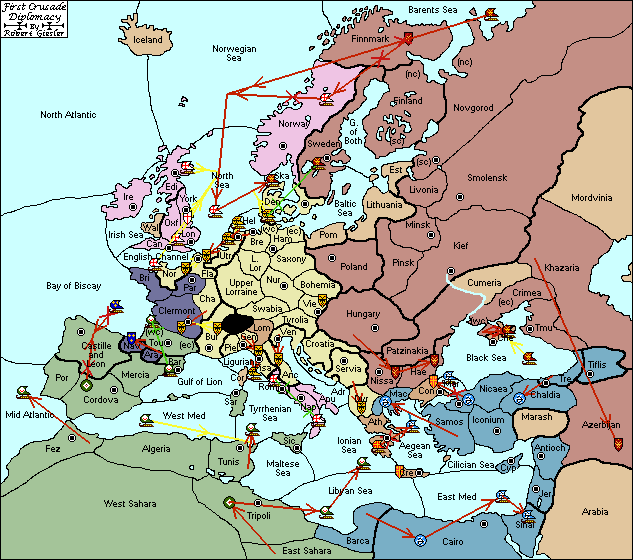
The map
- Better use of space sideways to the smallmap image to place the map controls, but re-layouts on smaller screens to make space for the map
- The map currently is the limiting factor for min width of the page ... could be scaled to be smaller, but we need to see details ...
- There are two "Bigmap" solutions implemented currently
– as known before, opening in a new window/tab (could be a popup div, but is this useful?)
– hover/tip over the smallmap, there is a "lens" that shows part of bigmap to inspect details (it's no zoom of the small map, but the real big map!).


 hide moves
 big map
Experimental (there should be a zoom popup):
Mouse: hover over map
Touch: tip on the map once and wait a second
Orders
- this might be obsolete if direct map input becomes standard ...
- Orders list is streamlined to one line per unit
- order types are done as buttons instead of dropdown
- the old "via convoy" dropdown is replaced by a double entry and icon to avoid another dropdown needed
- In sum, the needed dropdowns per unit are limited to 2 maximum (first place, second place) instead of 4 now (move type, first place, second place, via)
- dropdowns are no html-form elements but hidden mini tables for better inter-dropdown layout. this is neat, but needs some javascript to send ...
- Places have short and long name for better overview and communication (Variant need to provide this info though ...). Also the "via" has icons for convoy/land move (see the Finnmark dropdown!)
- having no html form dropdowns but scripted elements allows to keep multiple of them open same time for improved overview when planning orders.
- If you klick a dropdown, the line is highlighted for better focus. BUG – This highlighting works partially only now: the highlighting toggles back and forth with each klick on a dropdown, and therefore gets confused if two dropdowns are open same time. this can be solved with some better javascript logics instead of just toggling on/off
- Status of each order is shown very right no order at all = red, set-but-not-saved order = blue, saved order = gray, submitted orders = all green
there is a difference between "no order" and "hold" now, as currently one does not see if a unit *should* hold, or just has no set order yet - Saves could be done live per ajax after setting the order, making the save button completely obsolete and prevent deleted orders while chatting?
 | Haemimon |     |
|
||||||||||||||||||||||||||||
 | Cherson |  |
to |
|
 |
||||||||||||||||||||||||||
| Antioch | |
|
||||||||||||||||||||||||||||
| Finnmark | |
in |
|
|
||||||||||||||||||||||||||
| Marmara | |
to |
|
from |
|
|
orders focus (brown background dropdowns) is crudely implemented, not working on multiple dropdowns. just an idea, not fully implemented
save (wait)
submit (ready)
save (wait) submit (ready)Players list
- Streamlined the display of player details, trying to make it 1 line each
- grouped by game-specific data (Status, Votes, Nation, Centers, Missing to win, Units, Bet, Worth) and player specific (Name, Points, Reliability, last seen)
- Difference in Centers and Units is shown by colored numbers with +/– signs (done in CSS)
- I left out the graphical bars, showing how strong a player currently is compared to the rest ... is this feature important to you, or does it just add visual complexity? as a simple replacement i have added "to win" column
| Status | Votes | Nation | Centers | To win (18) | Units | Bet | Worth | Player | Pts | Reliab. | Last seen |
|---|---|---|---|---|---|---|---|---|---|---|---|
 | Pause, Draw | Holy Roman Empire | 12 | +6 | 12 | 10 | 19 | PlanetXXX13 | 108 | 98+ | 0247 | 02:33 PM |
| Almoravids | 7 | +11 | 9 | 6 | 14 | Strider | 466 | 98+ | 1339 | 03:40 AM | |
| England | 8 | +10 | 8 | 10 | 12 | Rawr!? | 80 | 98+ | 0719 | 10:00 AM | |
| | Extend | Seljuk Turks | 8 | +10 | 8 | 10 | 12 | Time-Out | 71 | 98+ | 0238 | 02:41 PM |
| | Byzantine Empire | 4 | +14 | 3 | 5 | 6 | Gekko | 78 | 60+ | 0319 | 02:00 PM | |
| France | 2 | +16 | 2 | 10 | 3 | Gamoosa | 80 | 80+ | 3720 | 04:59 AM | miss! | |
| | Draw | Russia | 9 | +9 | 9 | 10 | 14 | Hirnsaege | 511 | 98+ | Now | 05:19 PM |
Archives
Orders, Maps, Messages archive to be added here, or to each section where they belong.
Footer
Server Status, etc. to be added (is it needed on each game page?)